Civ 7’s Deluxe Edition release has only been out for a day and the internet’s already abuzz about its UI and other pitfalls, but is it truly that bad? Let's delve into the game’s UI elements and discuss whether it lives up to—or falls short of—the online chatter.
← Return to Sid Meier's Civilization VII main article
Is Civ 7's UI as Bad as They Say?
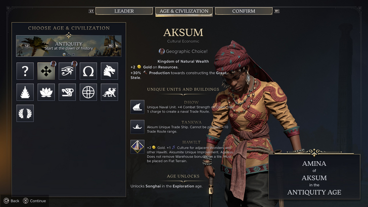
Civ 7 has been out for just a day for Deluxe and Founder’s Edition owners, and it's already drawing criticism, particularly for its UI and missing quality-of-life features. While it's easy to join the chorus of complaints, it's crucial to take a step back and critically assess whether the UI is as problematic as claimed. Let's break down the UI piece by piece and see if it meets the standards of an effective 4X interface.
What Makes a Good 4X UI?
The design of a 4X game's UI can vary widely based on the game’s context, style, and objectives. However, there are common elements that experts agree contribute to a successful 4X UI. Let's evaluate Civ 7’s UI against these key elements to see how it measures up.
Clear Information Hierarchy

A good UI prioritizes information based on its importance to gameplay. In 4X games, frequently used resources and mechanics should be easily accessible, while less critical features should be reachable within a few clicks.
In Against the Storm, for example, building info menus exemplify clear information hierarchy. Each building's menu is divided into tabs, organizing data by relevance and usage frequency. The default tab focuses on common actions like worker assignments and production settings, while less-used features are tucked away in other tabs.
Now, let's assess Civilization VII’s resource rundown UI. It functions, but not as effectively as it could. The summary menu organizes resource allocation across the empire into income, yields, and expenses via dropdown menus. While structured well, it lacks deeper specificity. For instance, it doesn’t specify which district or hex generates what, and there's no comprehensive breakdown of expenses beyond unit upkeep. While not the most effective, it's still functional and could be improved with more detailed information.
Effective and Efficient Visual Indicators
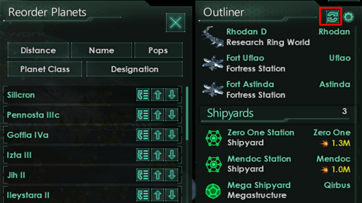
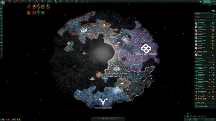
Visual indicators like icons and colors should convey information quickly and effectively, reducing the need for extensive text or numbers. Stellaris's Outliner, for instance, uses visual indicators to show the status of survey ships and colony needs at a glance.
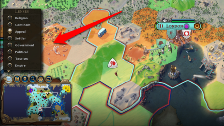
Civ 7 relies on iconography and numerical breakdowns for resources, but it also includes effective visual indicators. The tile yield overlay and settlement overlays are good examples, though some players miss certain lenses from Civ 6, such as appeal and tourism. The lack of customizable map pins is another point of contention. While not perfect, Civ 7's visual indicators have potential for improvement.
Searching, Filtering, and Sorting Options
As games grow complex, features like search bars, filters, and sorting options become crucial for managing visual clutter. Civ 6's search function is a great example, allowing players to locate specific resources or units quickly.
Sadly, Civ 7 lacks this search function, which many consider a significant oversight given the game's scale. Adding this feature in a future update, along with enhanced Civilopedia functionality, could significantly improve usability.
Design and Visual Consistency

The UI's aesthetic quality and consistency are vital for a cohesive player experience. Civ 6's cartographical style seamlessly blends with its overall aesthetic, enhancing the game's identity.
Civ 7 opts for a minimalist and sophisticated design, using a restrained color palette and simplified iconography. While this aligns with the game's regal and refined theme, it may not resonate with all players due to its subtler visual approach. The design is deliberate and professional but might not have the immediate impact of more vibrant UIs.
So What’s the Verdict?
It’s Not The Best, But Undeserving of Such Disapproval
After examining Civ 7’s UI against these criteria, it's clear that while it has room for improvement, it's not nearly as bad as some claim. The lack of a search function is a significant issue, but overall, the UI's flaws are minor compared to the game's other strengths. With updates and player feedback, the UI could improve and win over more fans. For now, it's functional and doesn't detract from the overall experience as much as the internet suggests.
← Return to Sid Meier's Civilization VII main article
Sid Meier's Civilization VII Similar Games


 Latest Downloads
 Downlaod



 Top News